Spot On
Client
  • Planned Parenthood
  • Product
  • iOS app
  • Android app
  • Years
  • 2015-2018
  • Project contributions
  • Creative strategy
  • Art direction
  • Team management
  • User experience design
  • Qualitative user testing
  • Product design lead
  • Illustration
  • Spot On is an inclusive period and birth control app for all people to track and learn about their cycles. We worked closely with the Planned Parenthood team to create, iterate, and eventually hand off iOS and Android apps.
    In the app, users are able to manage seven different types of birth control including the pill, patch, ring, shot, IUDs, and implants. They can also enter their mood, symptoms, and actions daily to see if there are any patterns in their cycle.
    Outcomes
    Over 1.4 million downloads
    40% monthly active users
    Featured in Apple Health & Fitness
    Selected awards
    Communication Arts Award of Excellence
    Fast Company Innovation by Design Award
    Core77 Design Awards
    Selected articles
    A Serious Game-Changer
    Make Your Period (a Little) Easier
    For anyone who gets a period or uses birth control
    UX & strategy

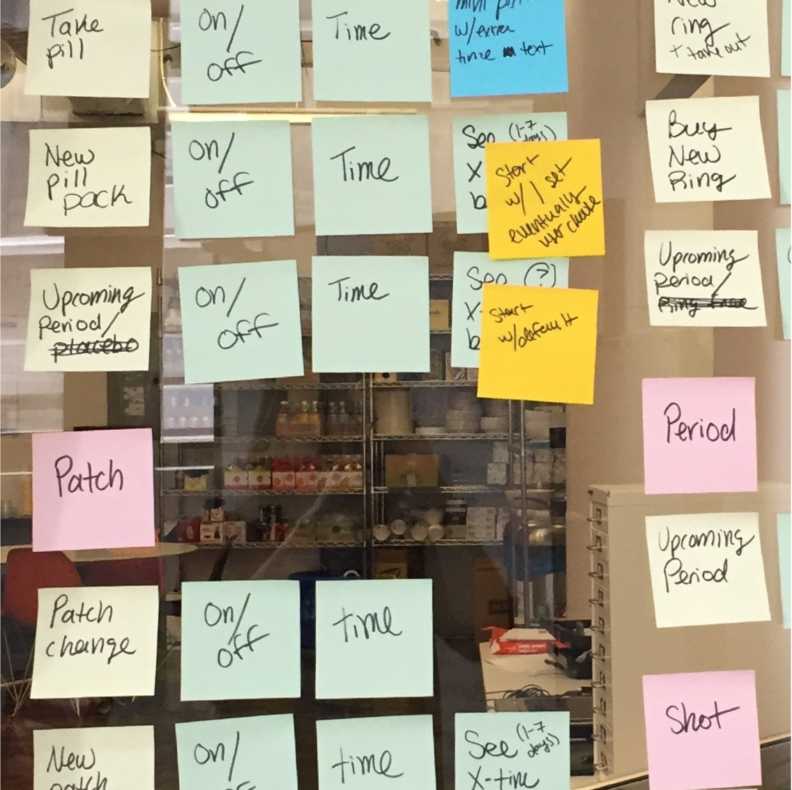
    The team took a look around, and we and saw there was a real lack of reliable information around cycles and birth control in period tracking apps. A lot of period trackers were focused on getting you pregnant, and were swimming in a sea of pink flowers.

    We wanted to leverage the expert health information that Planned Parenthood provides to help bridge that knowledge gap. This led to an effort to create a system that would support thousands of individual birth control paths that would look like just a few simple steps to users.

    Core tasks included:

  • Competitive analysis of popular period trackers
  • Meeting with stakeholders and health information experts
  • Defining key app differentiators
  • User flows and wireframes for onboarding, daily use, and missed methods
  • Running and supporting user testing
  • Continual iteration to meet user needs over the years
  • Design

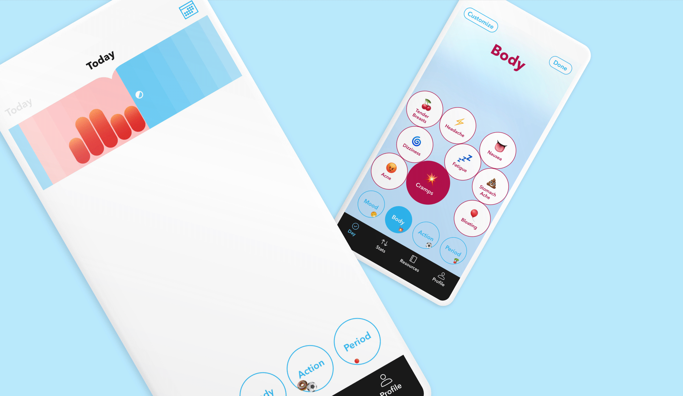
    Turns out, users were not so into the pink flowers. In response, we used a gender neutral design palette and introduced Cycleosauris to the world! Because at the end of the day, a dino makes just as much sense as a flowers for periods.

    Design considerations included:

  • Balancing innovation with feasibility to create joyful and unique interactions
  • Creating a library of styles to promote scale and consistency
  • Gender neutral color palette and language
  • Illustrations and animations galore
  • Designers working within Xcode and Android Studio for pixel perfect design
  • Key features
    Daily entry is easy & entertaining
  • Prioritized prompts surface the most important information
  • 12 rotating templates populated with fun facts and tips
  • Customizable mood, symptoms, and action entries
  • Animated prompts and entry tracking to encourage activity
  • Multiple ways to view & manage cycles
  • Compare symptoms on a calendar
  • Organize personal stats to review cycle by cycle
  • Simple step by step onboarding
  • A modular profile to review and update customized cycle information
  • Case studies