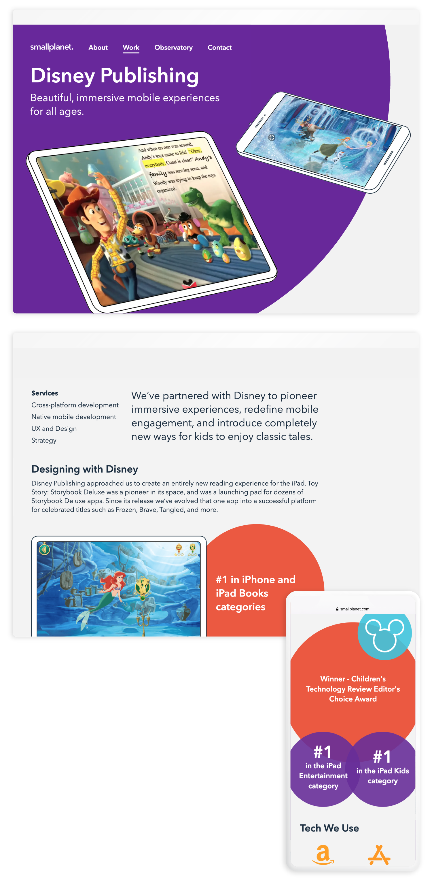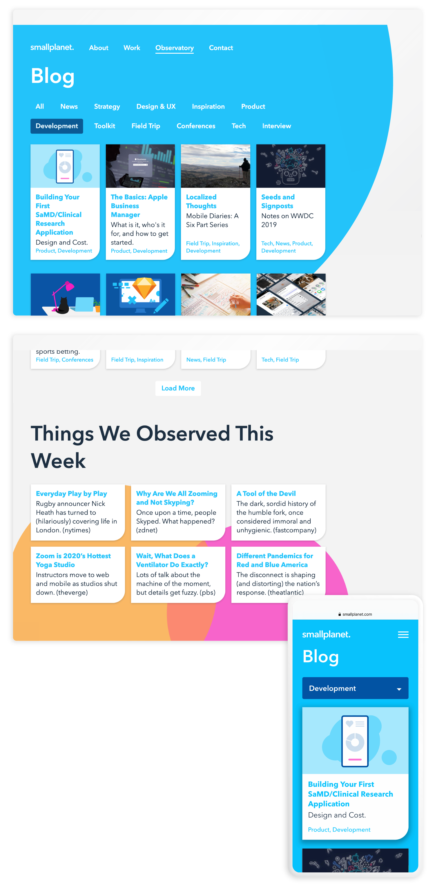
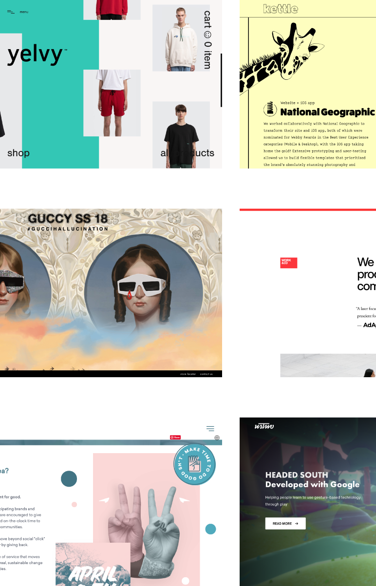

Starting with an exploration to look at aspirational brands and competitors websites, we reviewed core features and overall look and feel. As a team we discussed what worked well, and what we felt we could improve upon when speaking to our own brand. From this, we were able to create a set of features that would display our skills, while also surfacing original content and thought leadership. Core tasks included:

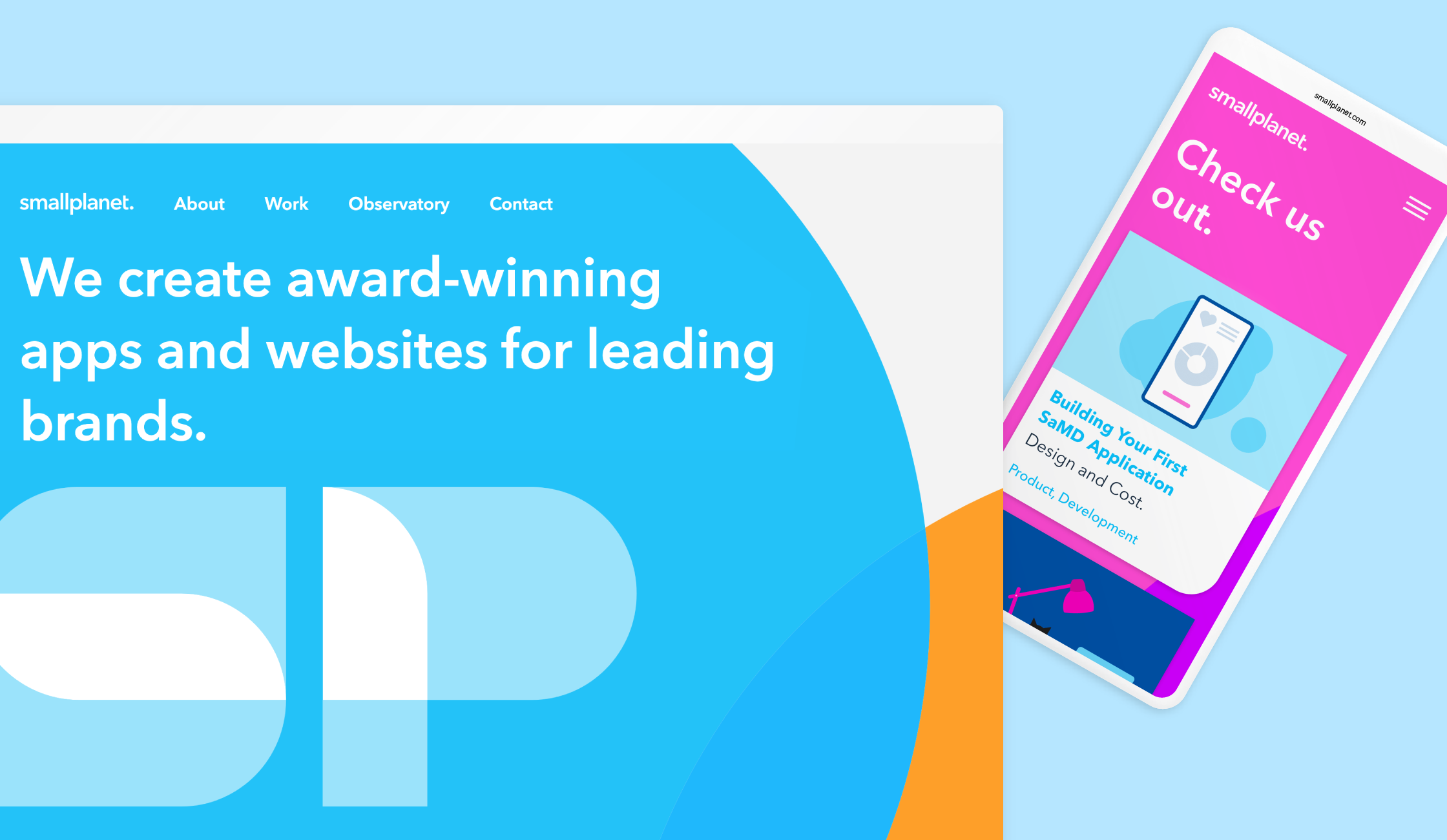
After several design iterations, we decided on a design direction that showcased rotating circle supergraphics, an idea rooted in Small Planet's original planetary branding. We broadened the color palette and implemented a simplified approach to iconography. These design decisions were also expanded into all new Small Planet branded materials. Design considerations included:
