
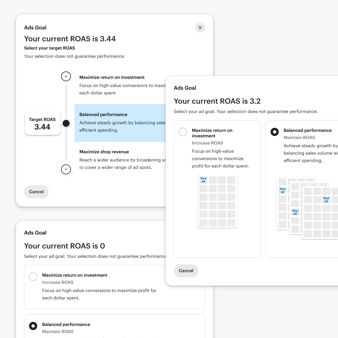
Early interviews showed sellers think in revenue-vs-spend terms but don't know ROAS, return on ad spend, as a metric, and three early concepts for setting a ROAS target — text-only, a slider, text-and-image — all left them unsure what their choice would do. That told us the problem wasn't explaining ROAS better; ROAS was the wrong mental model entirely. I pushed the team to redesign around three plain-language strategies instead: Increase Orders, Balance Orders with Return, Increase Return. A larger evaluative study confirmed the fix: preferences balanced across all three options, and orders emerged as the metric sellers actually reasoned in. It also surfaced gaps that shaped final scope — confusion between a target and a guarantee, and an unmet desire for the tool to account for profit margin, which became a seed for Listing-Level Bid Strategy. Post-launch feedback showed the strategy names still felt abstract, so we renamed them to describe literally what they do: Increase Visibility, Efficient Spending, Lower Click Cost. What I owned:
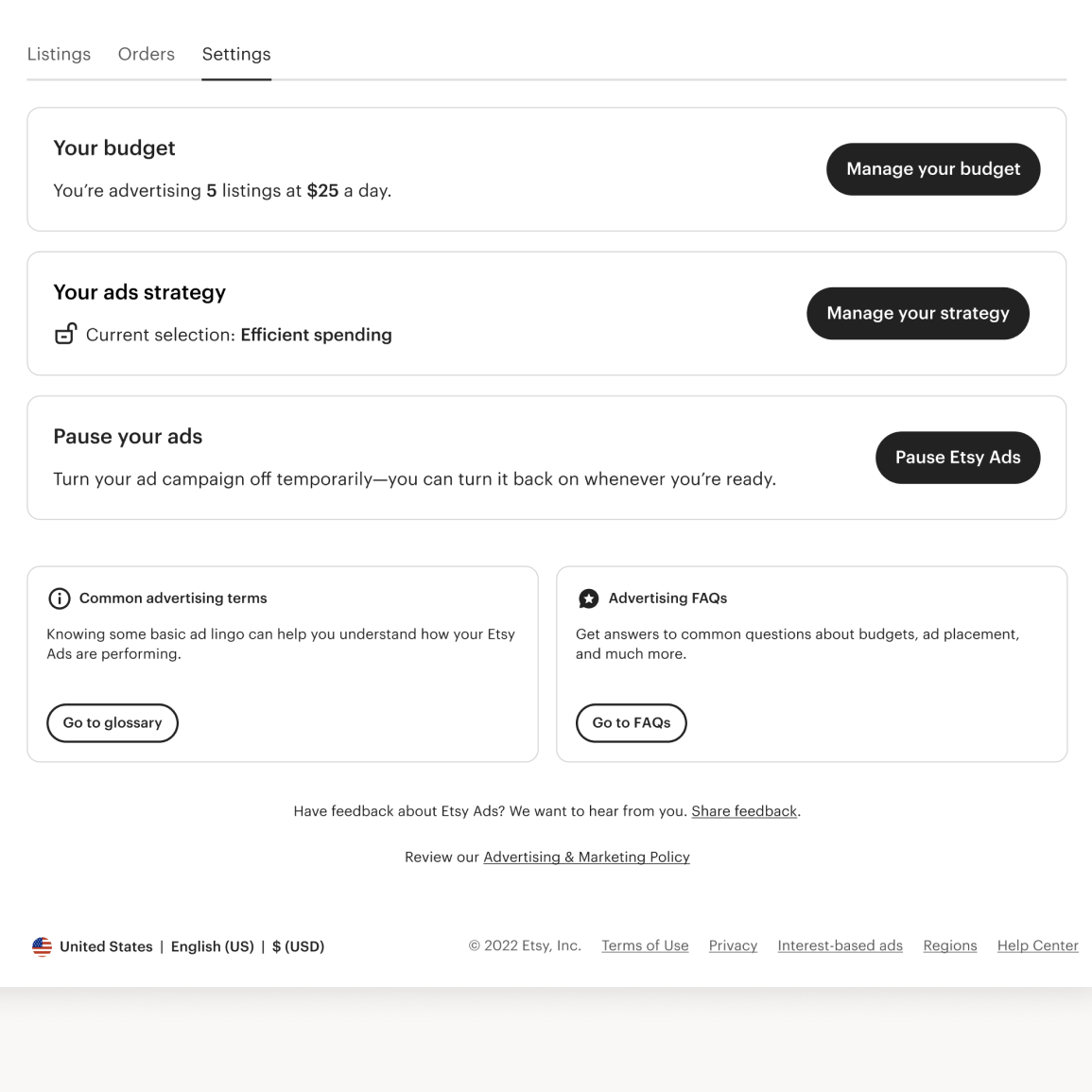
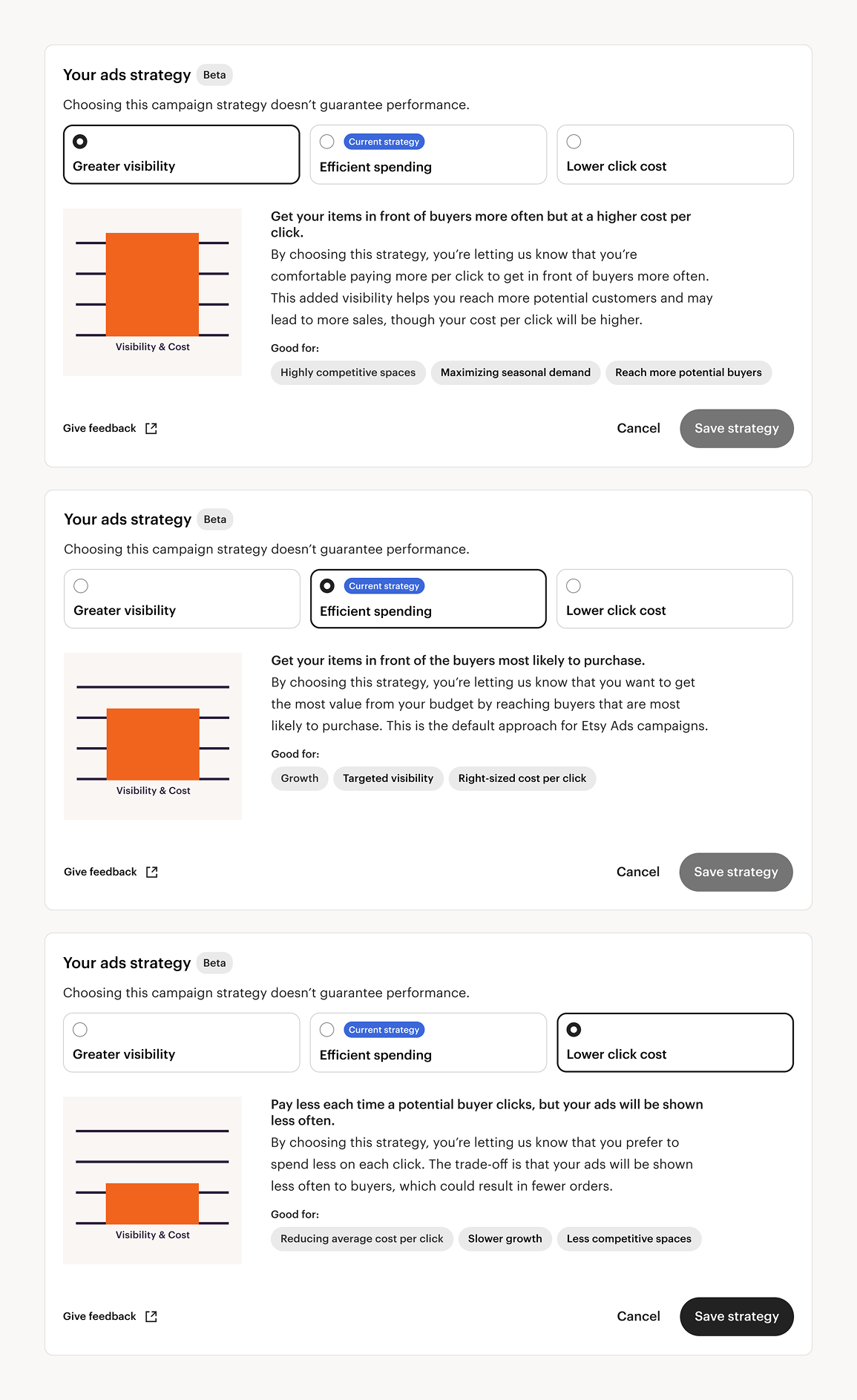
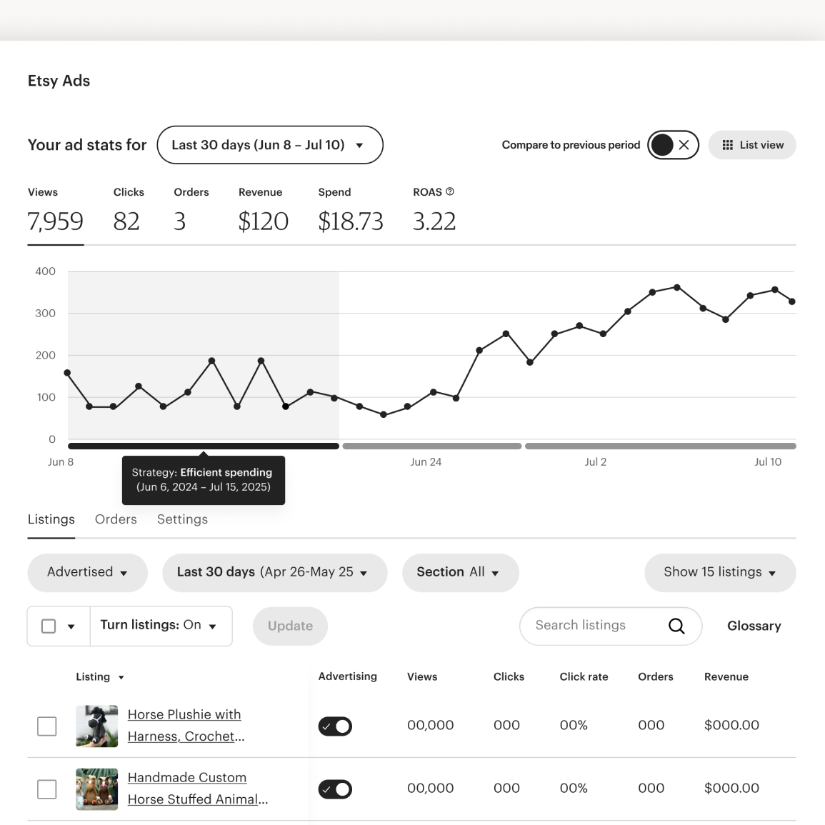
With the introduction of Campaign Strategy, I consolidated everything sellers previously managed in separate places — budget selection, strategy selection, and turning the campaign off entirely — into a single settings module, so every lever that shaped ad spend lived in one place instead of scattered across the dashboard. I also designed around a hard constraint: the feature is only available to sellers with a daily budget of $25 or more. That threshold does double duty — it nudges lower-budget sellers toward growing their spend, and it keeps the feature limited to sellers whose budget is large enough for a strategy shift to meaningfully change delivery. Within the module, sellers choose from three strategies, each paired with its own illustration and a "learn more" detail view, so the tradeoff stays legible even though the underlying mechanics — bid multipliers tied to a hidden target ROAS — are fairly complex. Making that complexity legible without exposing sellers to a bid-multiplier mental model they'd never asked for was the core design problem here, not just picking a UI pattern. Finally, I wanted sellers to see how a strategy change actually played out in their performance, not just take it on faith. I designed an overlay for the dashboard's performance chart that marks when a given Campaign Strategy was active, so sellers could connect a strategy shift directly to the resulting change in their numbers — closing the feedback loop that research flagged sellers didn't have. What I owned:

This started from a narrower question: how do we get sellers to advertise more of their high-GMS listings? Research showed sellers constantly toggling ads for strategic reasons (a listing's ROAS or CPC drifting unfavorable, a niche listing cannibalizing a general one) and external ones (supply, seasonality). I turned this question into a workshop: I organized those reasons for toggling into five themes and brought together multiple ads squads — 20 people across functions — to ideate against each. Prioritization of listings won out, matching what sellers had told researchers directly they wanted (rank-ordering listings, capping spend per listing). That led to the moment that started this project, with my PM and EM: we already let sellers do this at the campaign level — what if it worked at the listing level? The first real fork: should listing-level strategy replace campaign-level, or run alongside it? I made the call to consolidate to one level only, so sellers got granular control without two settings that could contradict each other. What I owned:
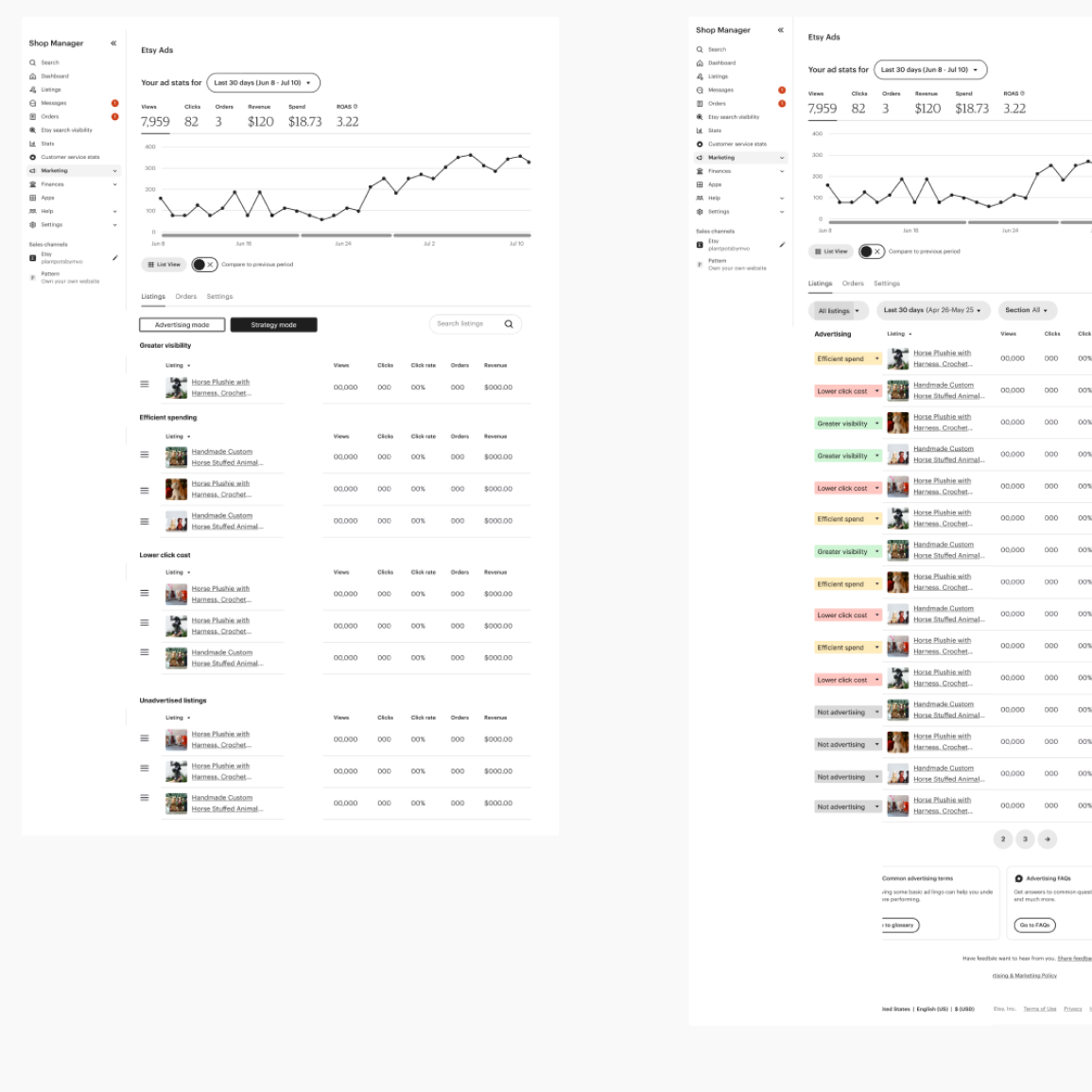
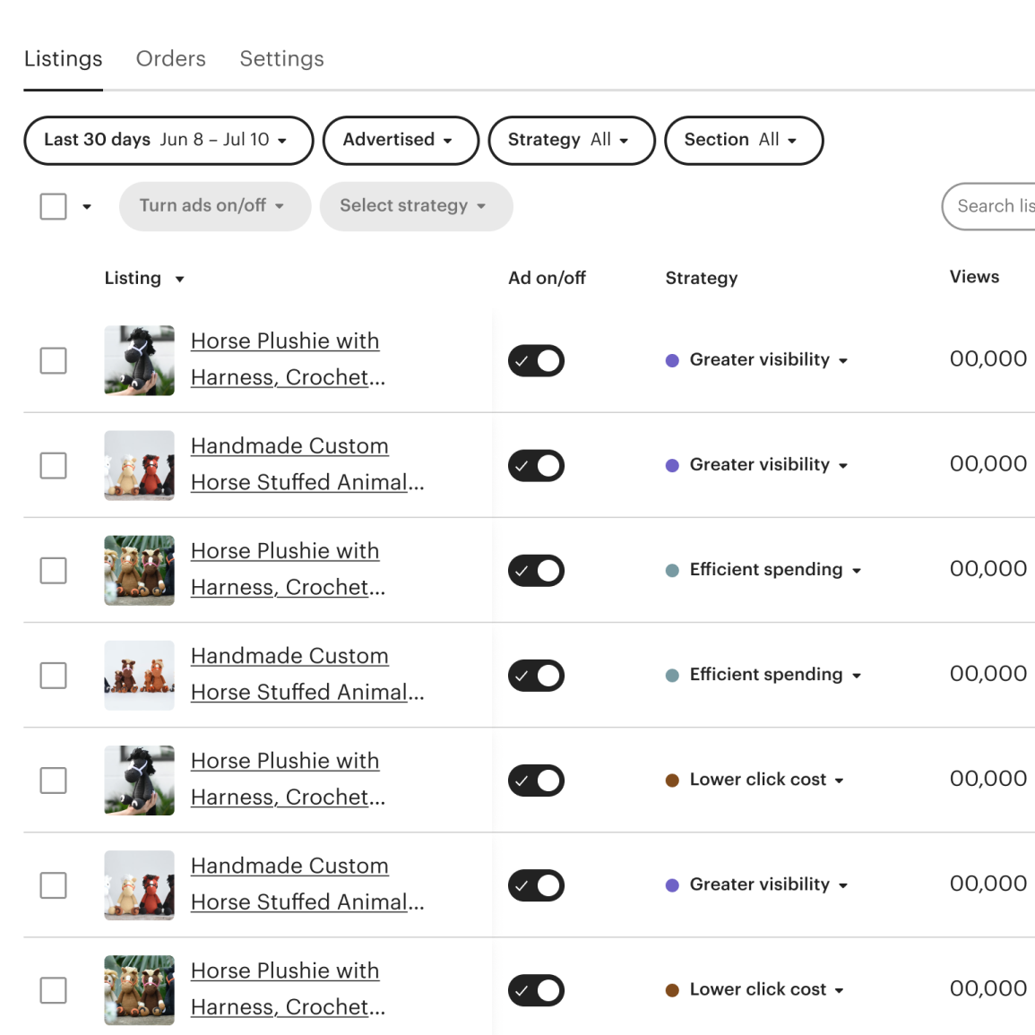
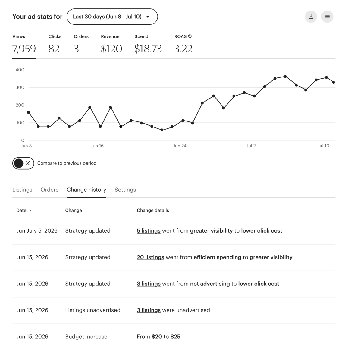
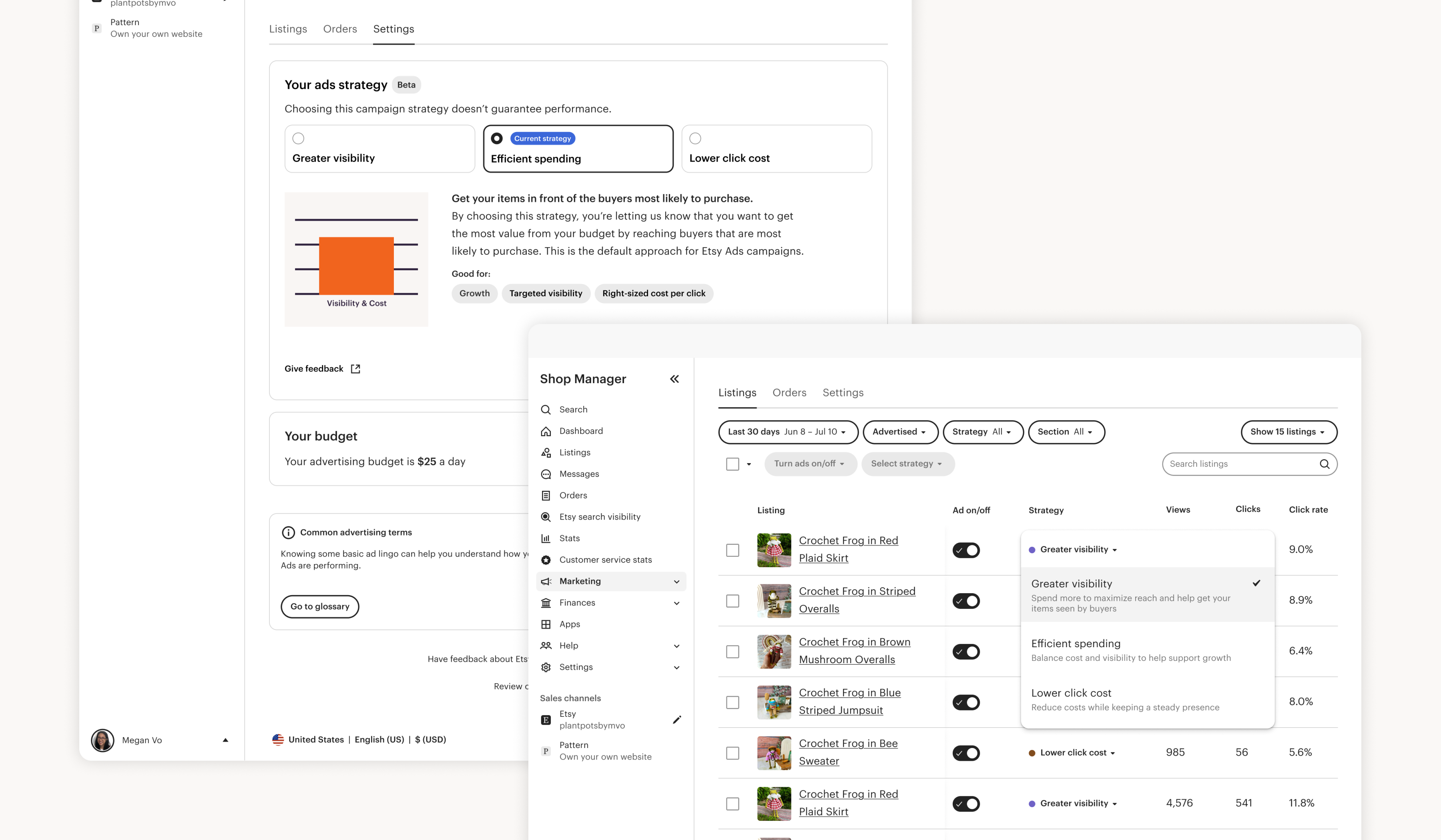
I explored several low-fidelity directions for how sellers would set a strategy per listing — filtering by strategy, grouping listings by strategy — and landed on a dropdown embedded directly in each listing row. It wasn't the most novel option, but it was the one with the least friction to build. A few decisions along the way shaped how these dropdowns actually worked. I kept the on/off toggle and strategy selector separate rather than combining them, so a seller could turn a listing on without being forced to pick a strategy in the same action, and so a listing's strategy would persist regardless of whether it was currently on or off. And since a table of dozens or hundreds of listings made it hard to tell which strategy was active at a glance — something that matters when it's telling you where your money is going — I worked with the design systems team to settle on a colored dot indicator per strategy. Bulk editing was needed to let sellers apply a strategy across many listings at once, since listing-level strategy was replacing campaign-level entirely; I'd wanted to move those bulk editing controls to the bottom of the page, matching a direction other seller teams were exploring, but we kept them at the top to ship faster. However, I was able to modernize the existing pattern rather than reusing it as-is. Campaign Strategy's chart overlay only worked when a seller had one strategy for their whole account — it broke down once sellers could run different strategies across potentially hundreds of listings — so I pushed for a new campaign-activity view that could house strategy changes alongside budget adjustments and advertise/de-advertise events instead. We also launched differently than Campaign Strategy, which had shipped quietly so we could watch how it behaved before drawing attention to it; this time we launched with a real marketing push, and I partnered with marketing and brand on the launch plan and graphics, on which seller cohorts to target, and with UX content on how to talk to each of them. What I owned:
